

Get your free ebook

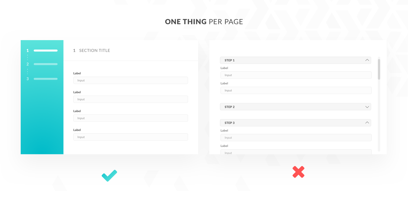
In the case of long and complex application forms, like the ones prevalent in fintech (e.g. insurance or loan application forms), dividing them into multiple smaller pieces is a common way of reducing the user’s cognitive load.
Presenting smaller, semantically aligned sections helps the user maintain focus on one specific task, and on the chunk of information that they are asked to provide.
Presenting the form as a multi-step process allows us to keep the user constantly informed about their location within the application flow. If they need to, they can also easily switch between steps.
The “one thing per page” approach also makes fixing errors much simpler compared to accordion panels, for example. Accordion panels have their place, but they often become more distracting when you start scrolling through them looking for an error.
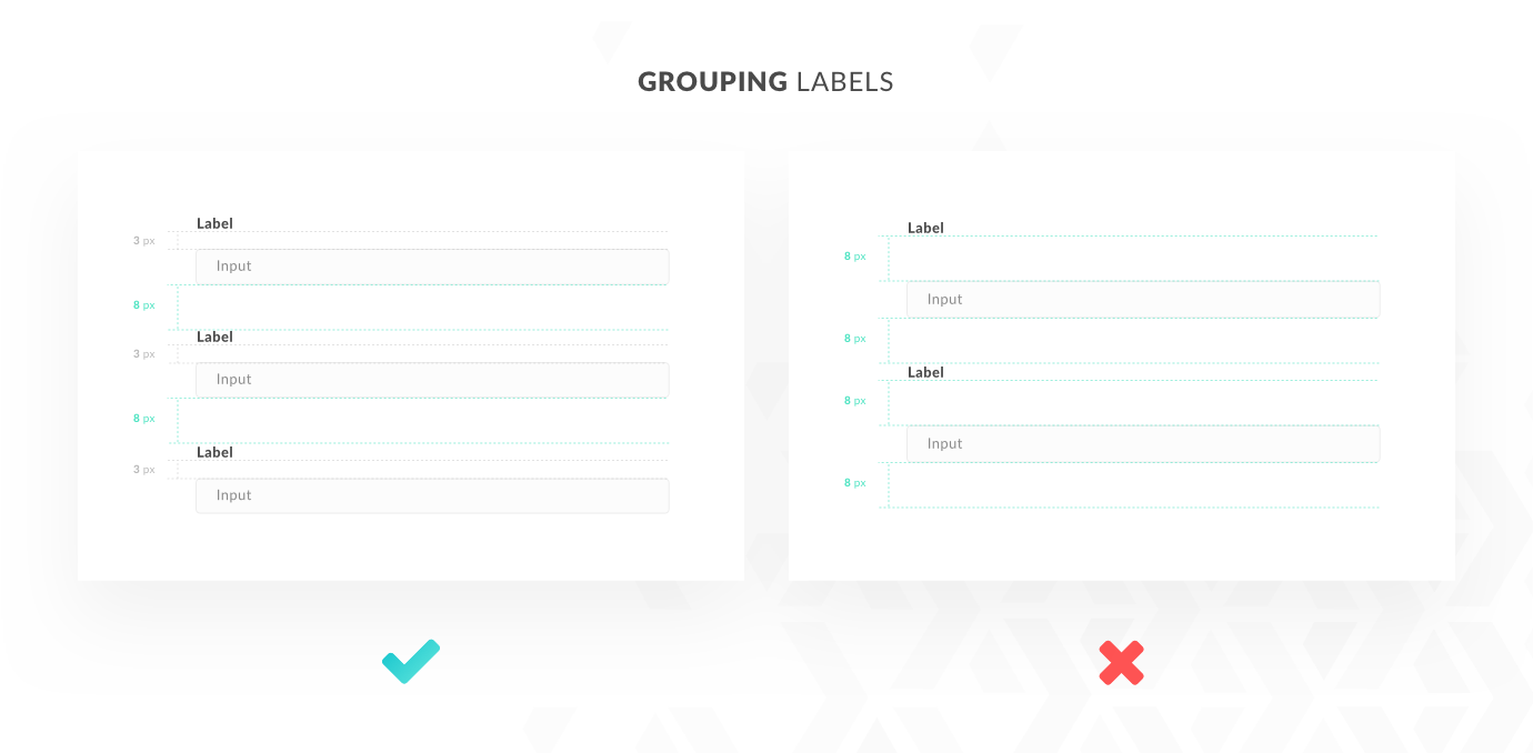
Grouping input fields visually with appropriate labels reduces the risk of user confusion. It also improves the readability of the form by clarifying its structure and visual hierarchy.
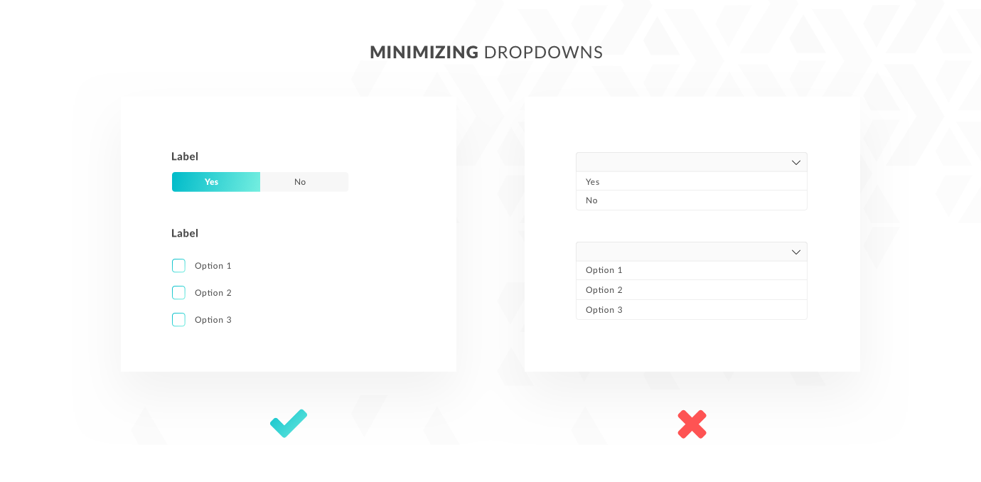
A general rule says that you should use dropdowns as a UI element if you’re dealing with more than 5 elements to choose at some point in the form.
Otherwise, you can comfortably replace dropdowns with radio buttons or segmented controls.
Presenting the user with all the possible options without hiding them in a dropdown comes with scannability boosts, which in turn has a huge impact on user performance and efficiency.
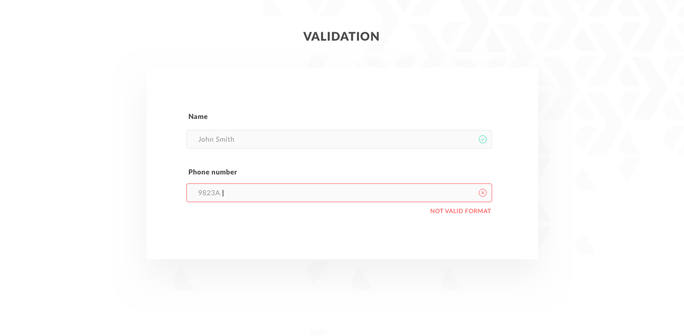
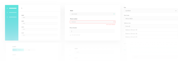
Inline validation providing instant feedback prevents the majority of mistakes that users can make in filling out the form.
However, that might not be enough when you take into account the users’ color vision deficiency, for example. In that case, additional confirmation about the button state through icons will cover the issue.
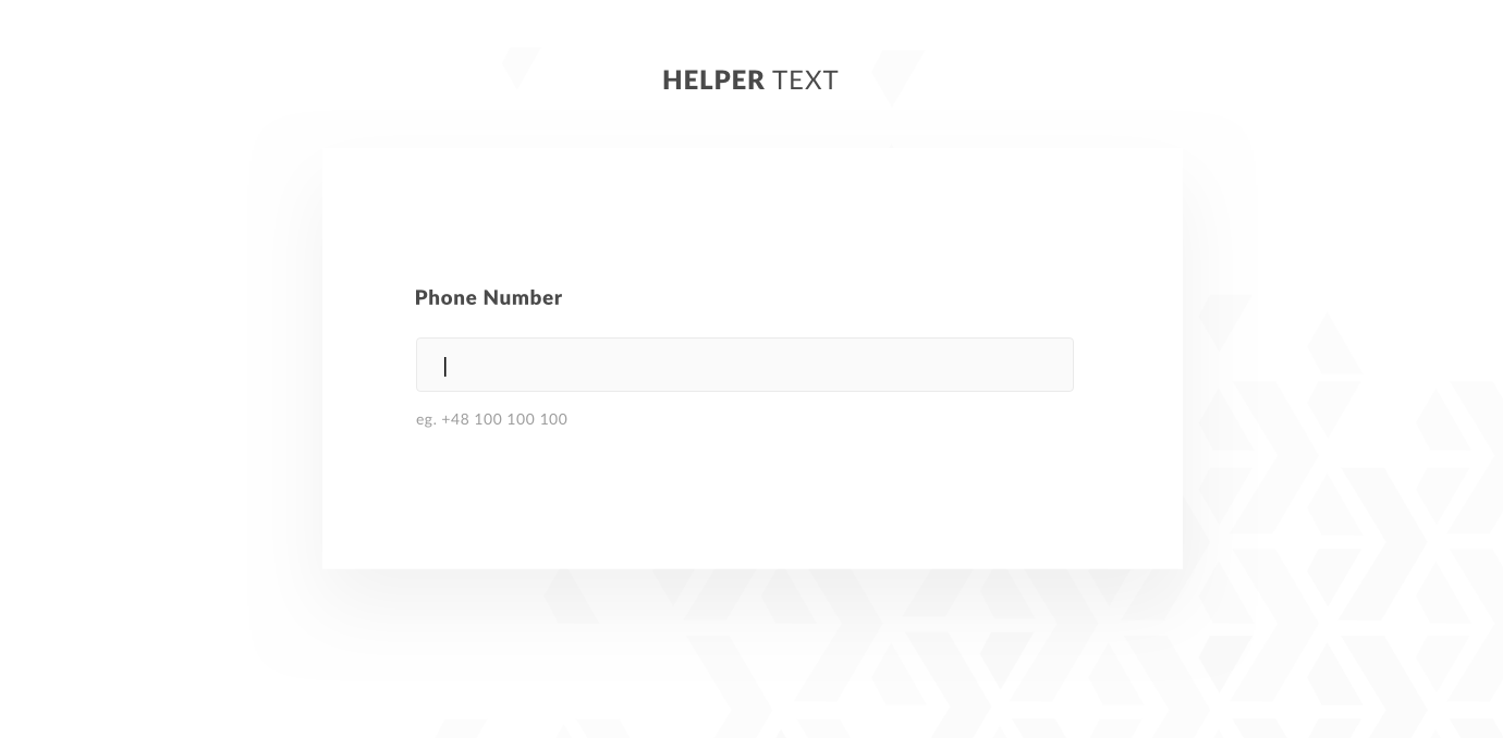
When it comes to supporting the user in filling out the form inputs, there is no better help than keeping them fully informed about the required data.
Pairing the input field with an appropriate title is one thing, but another important aspect from the designer’s perspective is giving the user a clear indication which data format the input field calls for. For example: should the phone number include the area code or not?
Adding an example of the data format just below the input field or in a tooltip on the side reduces the number of errors the user can make due to data format misconceptions. Detailed tooltips are especially useful when the data type you’re asking for calls for some additional explanation, such as the reason you’re requesting it or what it will be used for.
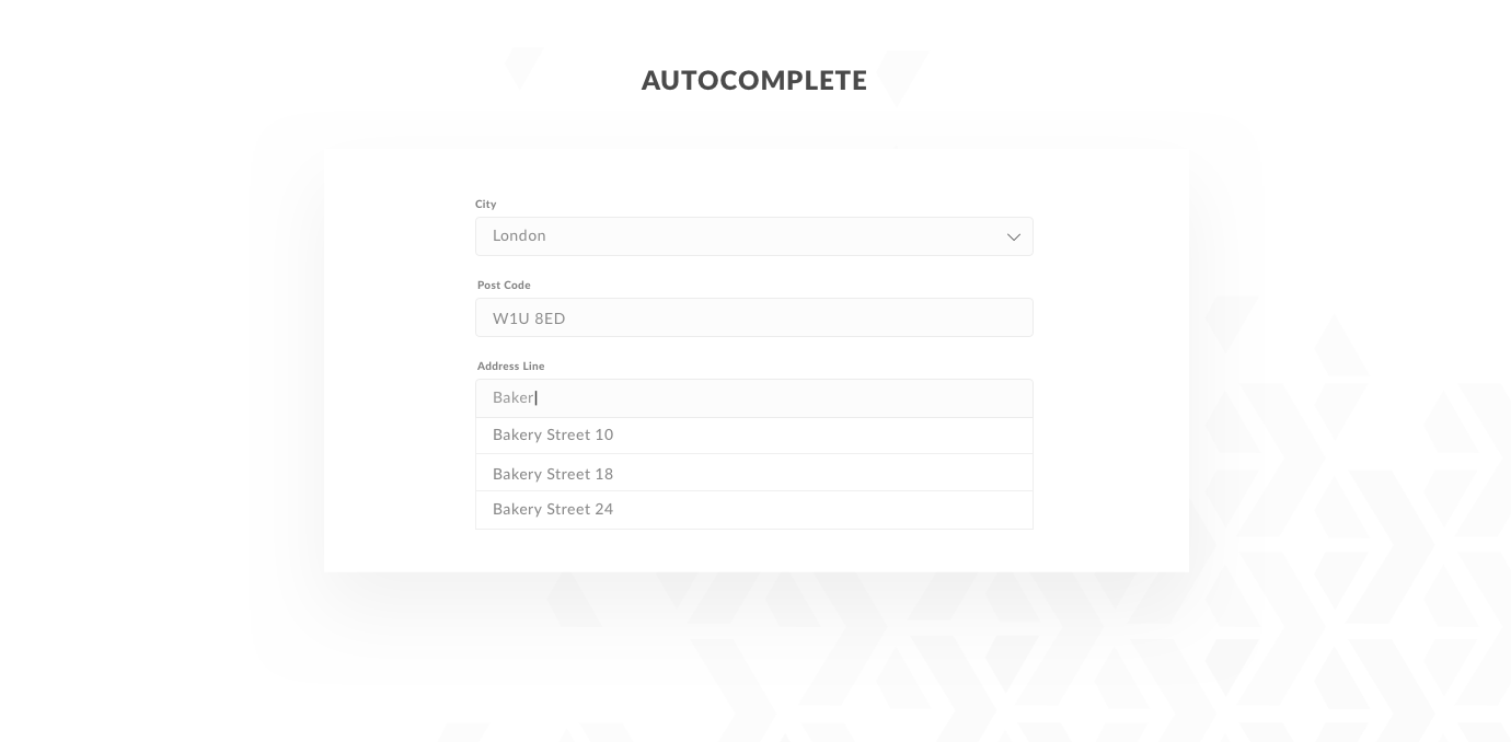
Although autocomplete as a form feature may appear slightly more complicated when it comes to technical implementation, it is definitely worth considering if you want to accelerate the form filling process. For instance, you can implement prefilling address detail input fields based on the postal code or geolocalization.
Nothing is more annoying than not being able to interact with a platform without facing a wall of text and inputs first.
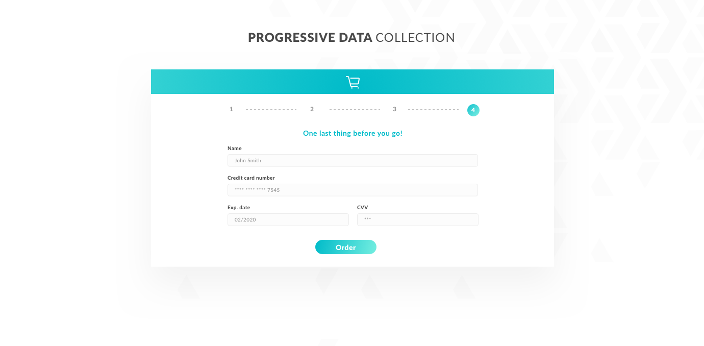
Progressive data collection is an approach in which you first ask the user only for a limited number of data types, necessary to start interacting with the system. Only then do you ask for additional data based on the actions that the user is about to perform.
For example, for a user that’s about to search through a range of products at an online store, requesting their email address and name will be more than enough for marketing purposes, such as sending them newsletters or recommended product offers. Other necessary data, like address details or the payment method, can be requested just before the user starts shopping.
Last but definitely not least: good copywriting. Clear, self-explanatory fields or section descriptions and simple tooltips are key to keeping the user informed and in charge of their actions.
What is the greatest benefit of supporting user performance and covering all the potential issues as they fill out a form? Increased efficiency.
But that’s not the only win you get from solid application form design.
A seamless user experience will also increase the conversion rates of your forms, boosting your progress toward achieving your business goals.
Additionally, if your form calls for sensitive data or involves money transactions, it is hugely important to keep the user comfortable during the entire process. A negative experience could harm your organization’s brand and credibility.
And finally, on a more human level, a well-designed application form is simply a breath of fresh air. It makes everyone’s daily digital lives easier.
After all, isn’t that what good product design is all about?
Thanks for reading my debut article on the STX Next blog!
If you want to see more cool stuff by our Product Design team, follow us on Behance.
And if you're nterested in more UX articles on our blog, how about you give this a read: Software Product Design: What Is the ROI of Good UX?